︎
Lluc
R. Cucurella
La Naturalesa del Píxel
Flora Futura
Malparlats t-shirt Shooting
Kaliu BC
Groove Gazette
Fira del Vi i Mercat de Nadal
Photobook
BAU Merchandising Shooting
Serralavella 2025
Motion Graphics Design
Orla BAU 2025
PATIMENT E.P
HAUS, Espai d’art i pràctiques contemporànies
Notable, a BAU Podcast
Design Dimensions
I’M, La (No) Passarel·la
[
Info
]
+34 635382766
llucrocu@gmail.com
@winebrowi
Mark
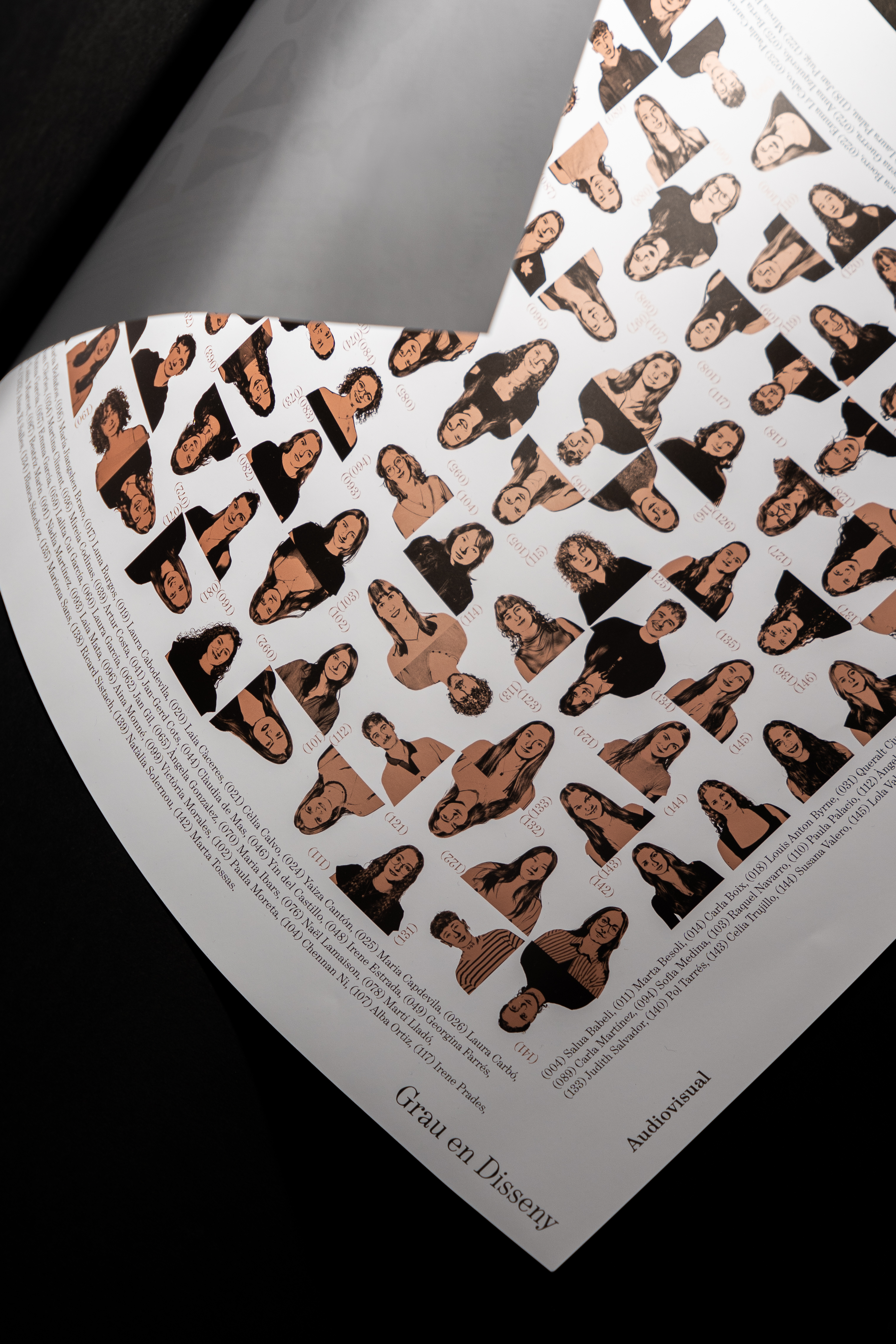
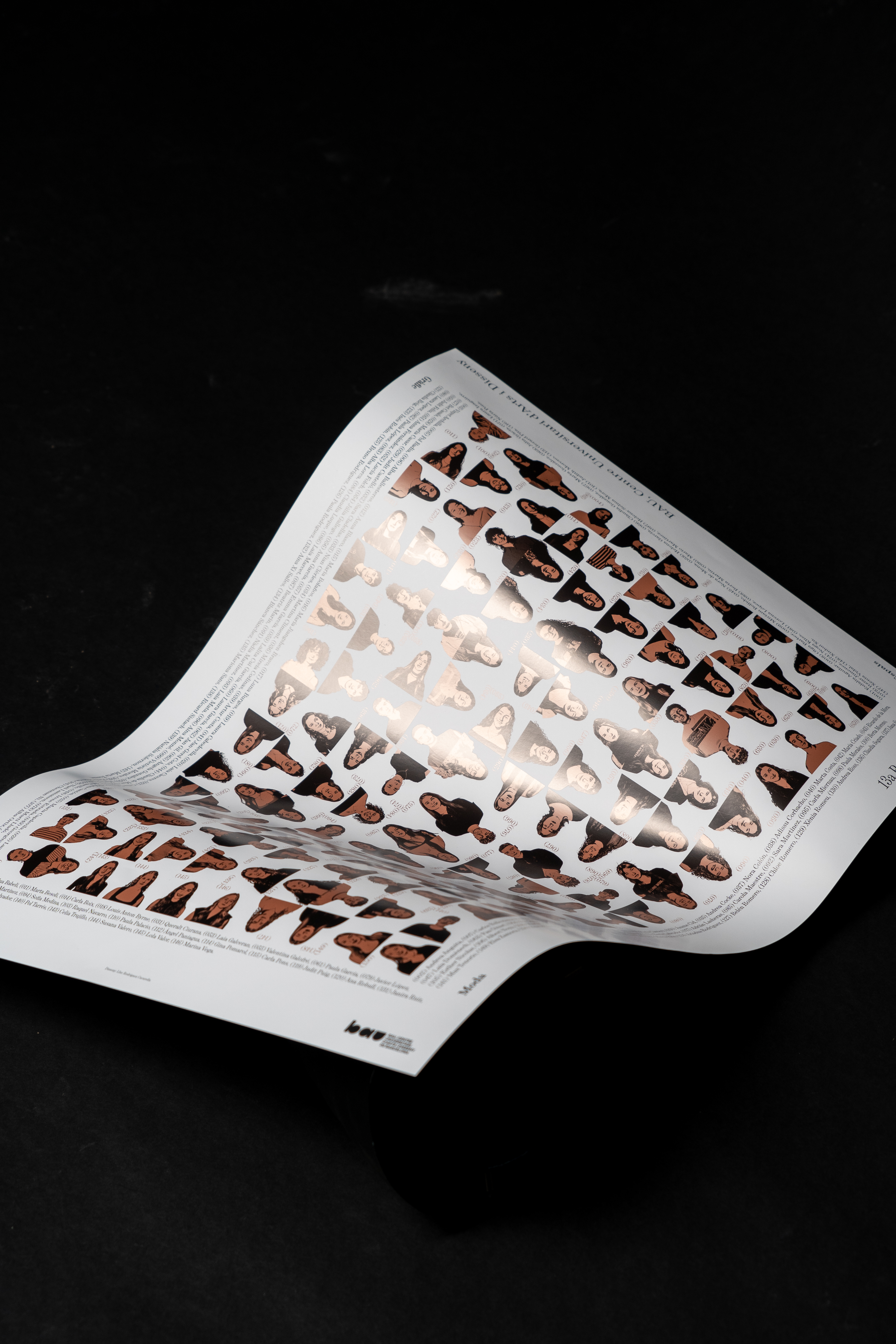
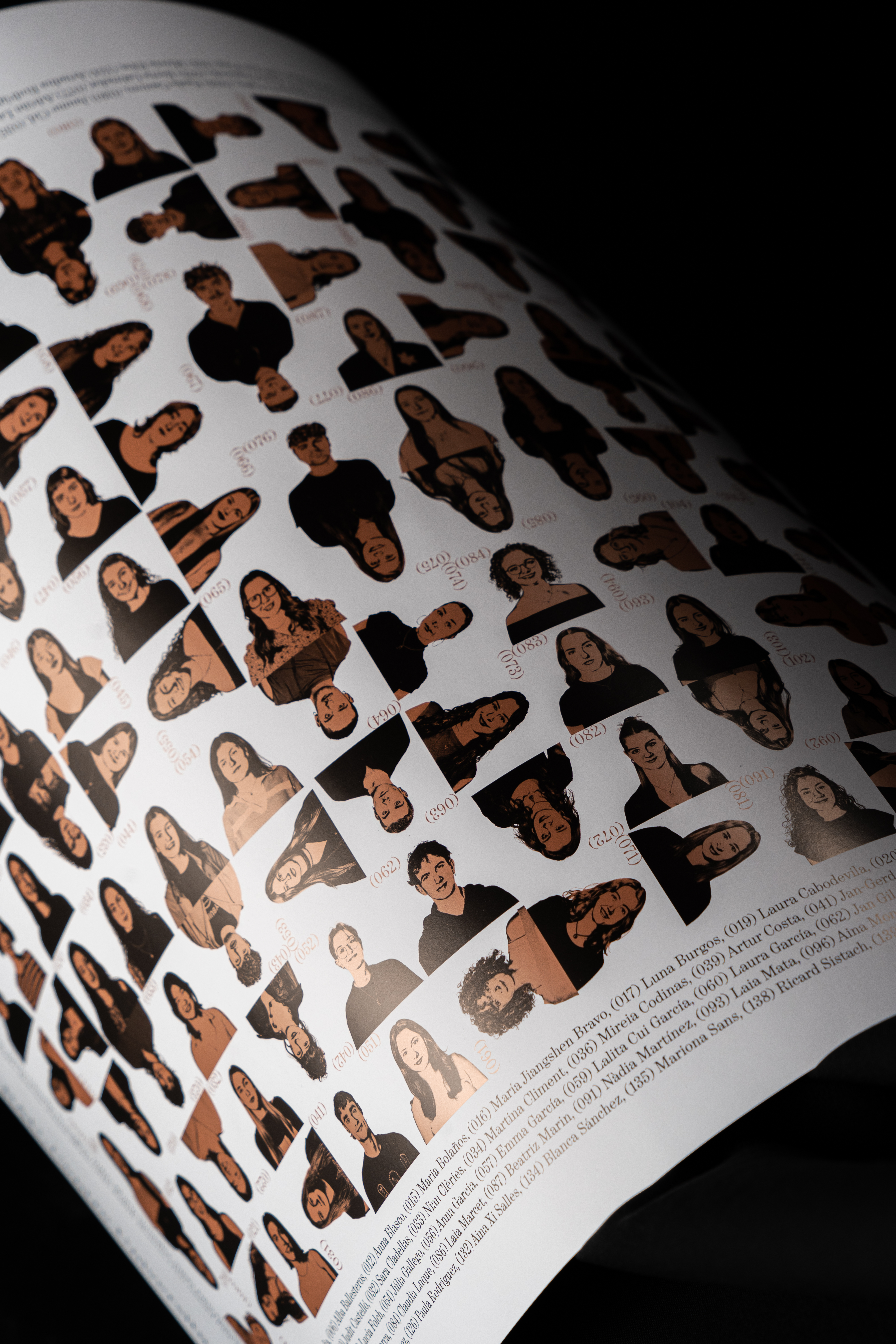
11. Orla BAU 2025
Barcelona / 2025
Graphic design
Client: BAU, Centre Universitari d’Arts i Disseny
Mark